
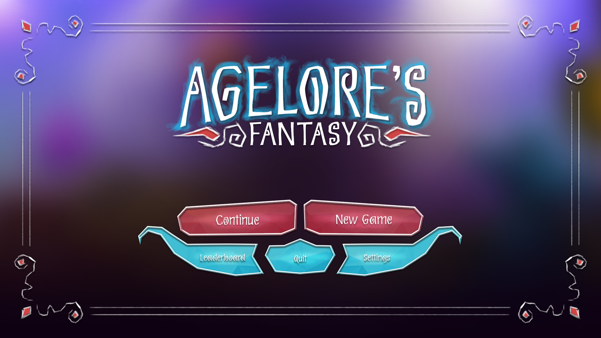
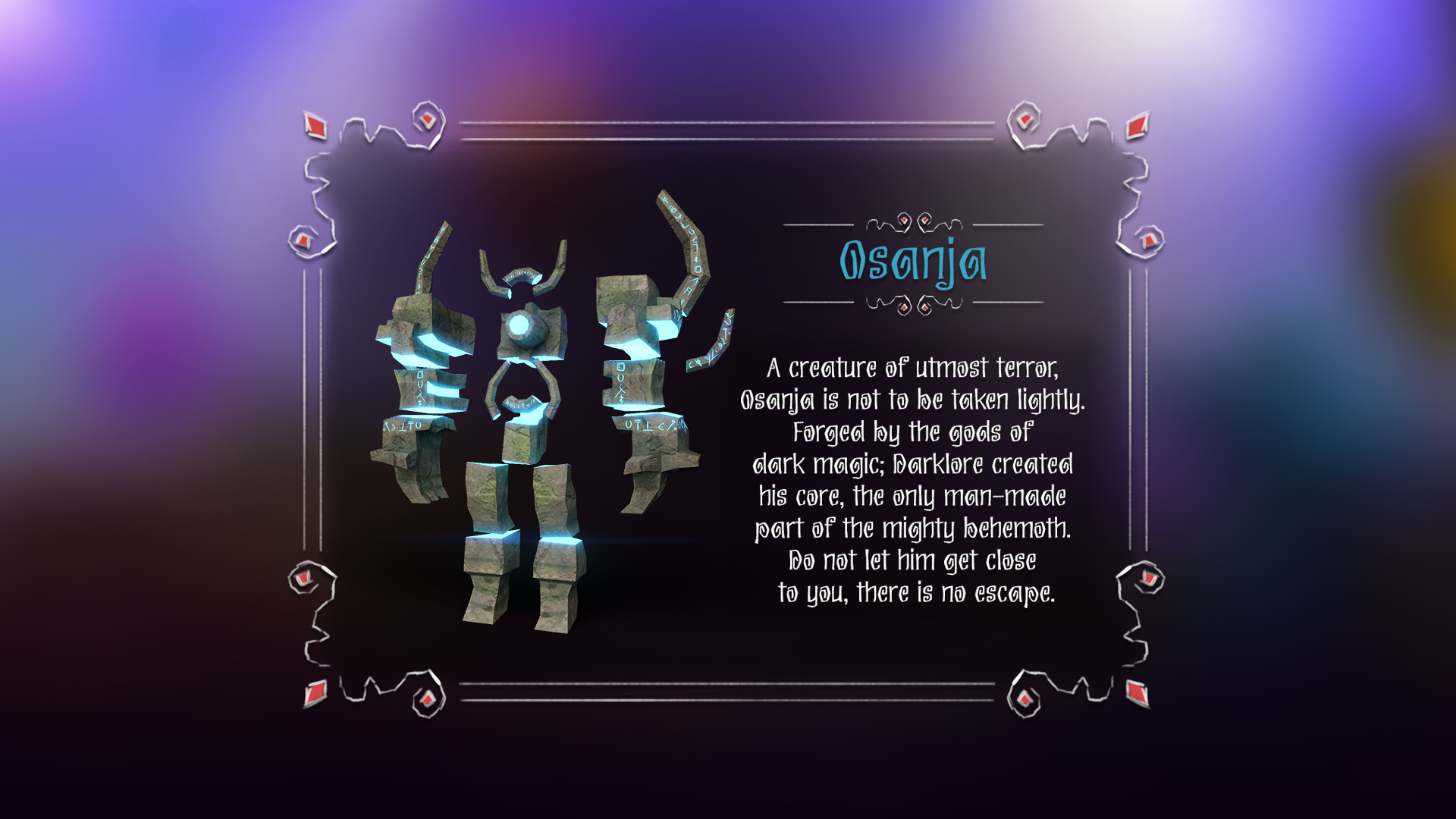
Agelore’s Fantasy is a vibrant low-poly action game where players step into the role of a wizard defending his realm against endless waves of enemies. Armed with just a staff and a shield, the player must survive as long as possible before time runs out. This was one of my earliest projects at Big Immersive, and I was responsible for designing the entire user interface from the ground up. Given the game’s magical setting and colorful 3D environments, I aimed to strike a balance between fantasy and function. After researching various visual directions, I developed a style using flat, rugged color blocks combined with hand-drawn motifs and borders. This gave the UI a whimsical, sketched aesthetic that felt both magical and grounded in the game’s fantasy world.
UI Visual Art Mockups
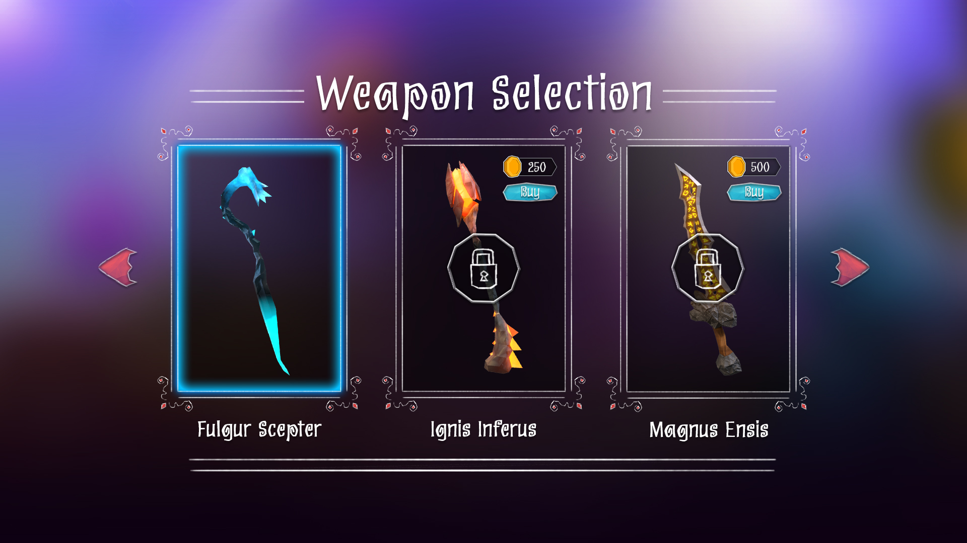
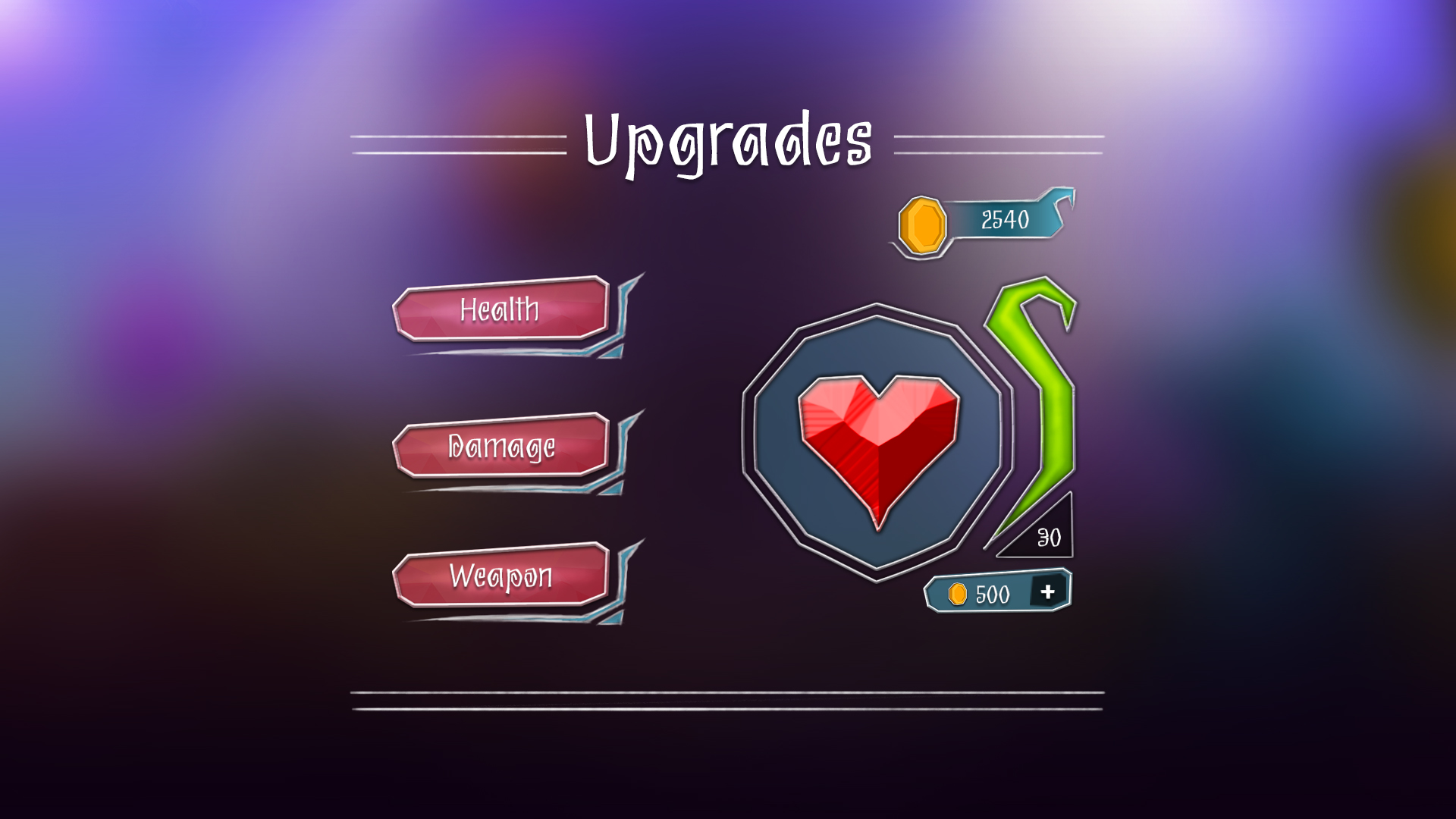
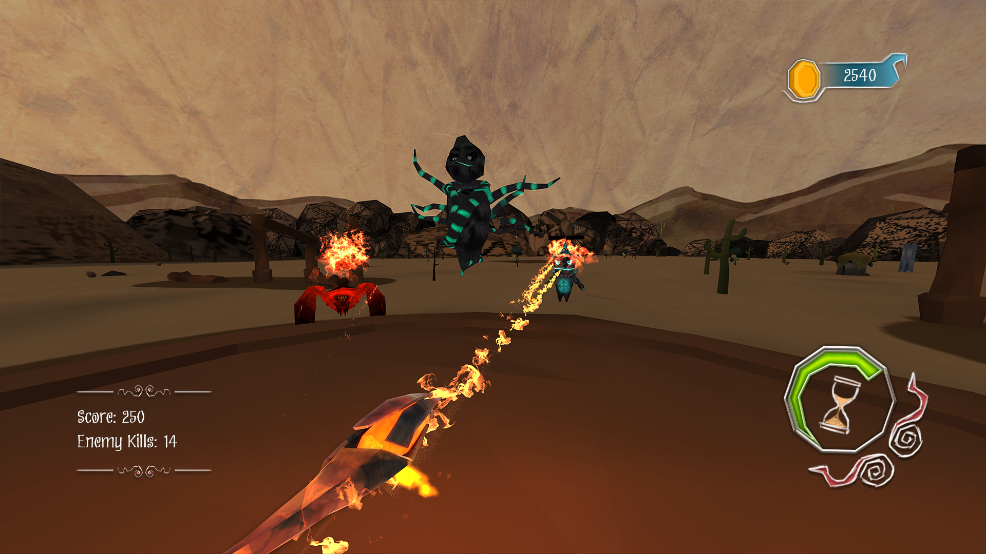
The images below showcase static mockups of the UI elements I conceptualized and illustrated, including menus, in-game HUD, and icons. I handled both the design and final art execution, ensuring consistency with the game's visual tone and user experience goals.

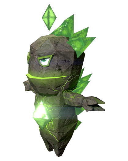
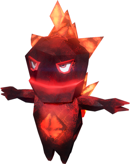
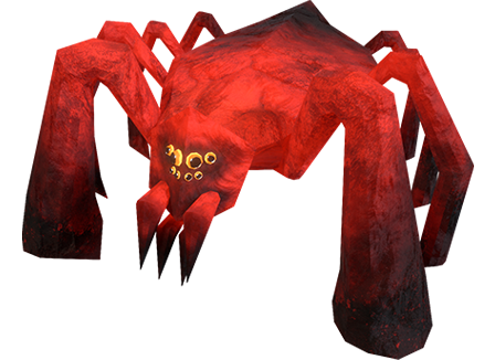
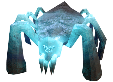
3D Models & Renders
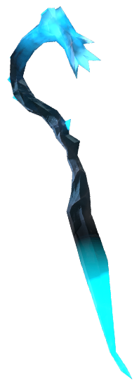
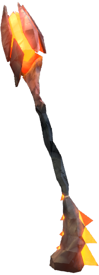
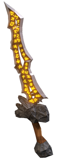
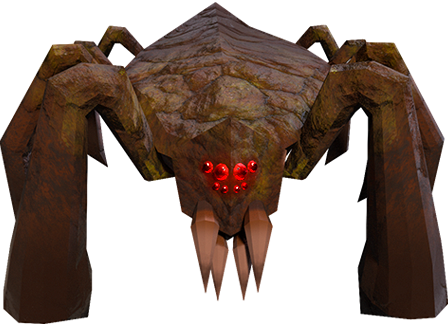
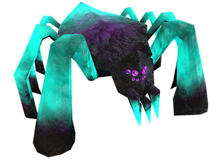
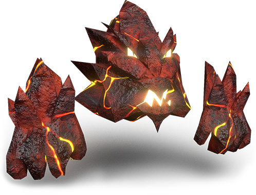
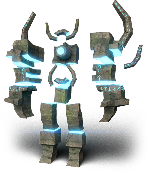
Beyond the UI work, I also contributed to some of the game’s 3D assets. I modeled and textured select objects and was solely responsible for rendering those elements for use in the UI as well as for marketing materials. This gave me the opportunity to ensure visual consistency between the UI and in-world assets.


Design Process And Decisions
Moodboard & Visual Direction:
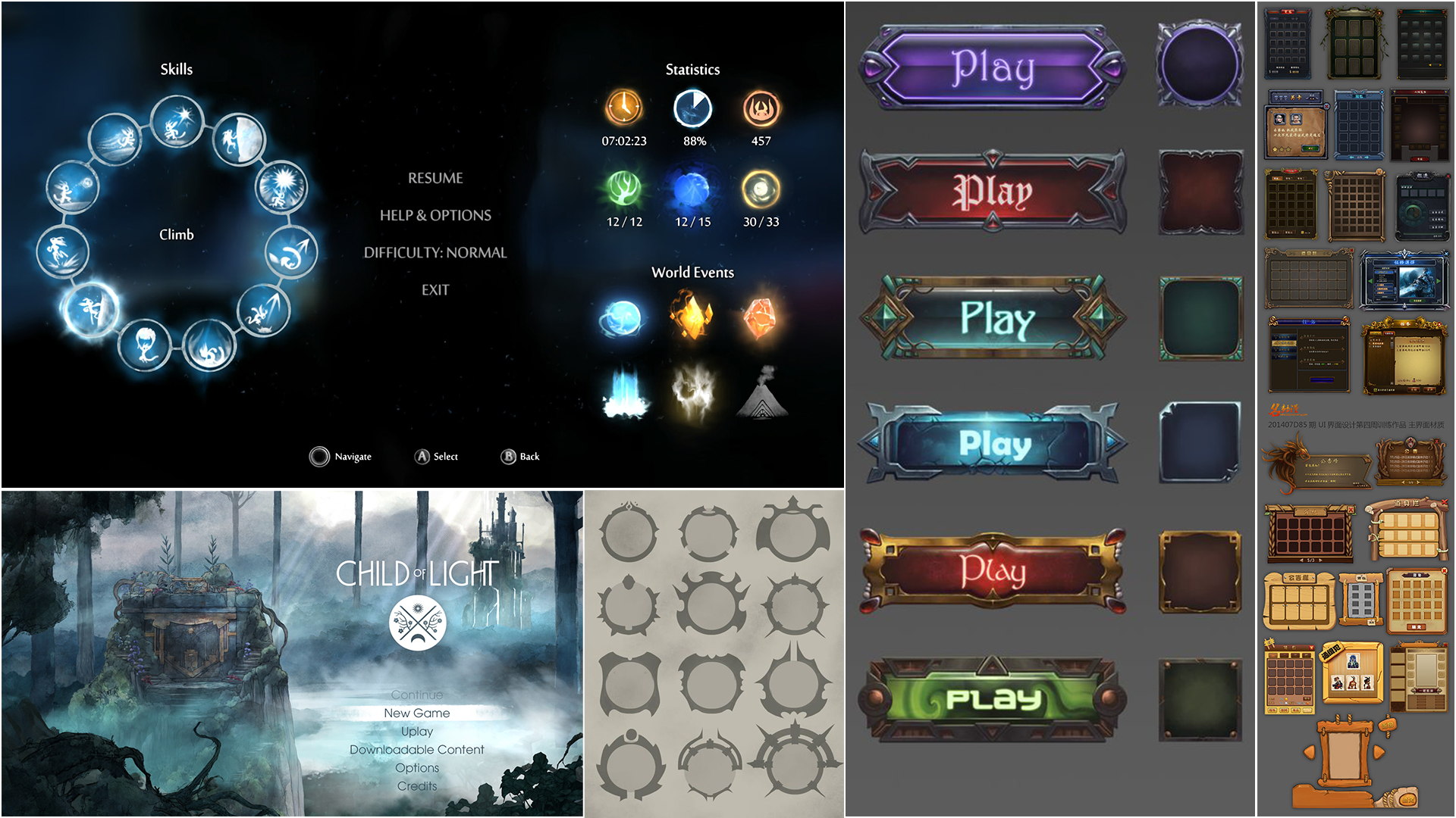
Finding the right visual direction for the UI was one of the more challenging aspects of this project. The low-poly fantasy aesthetic was new territory for me, and the game’s lightweight scope meant the UI had to remain clean and minimal. I gathered many references during early exploration, and Ori and the Blind Forest stood out as a key source of inspiration—especially for its painterly and emotional tone. While I ultimately chose a more raw, sketched visual approach, that reference helped shape my thinking around mood and clarity.
Typography:
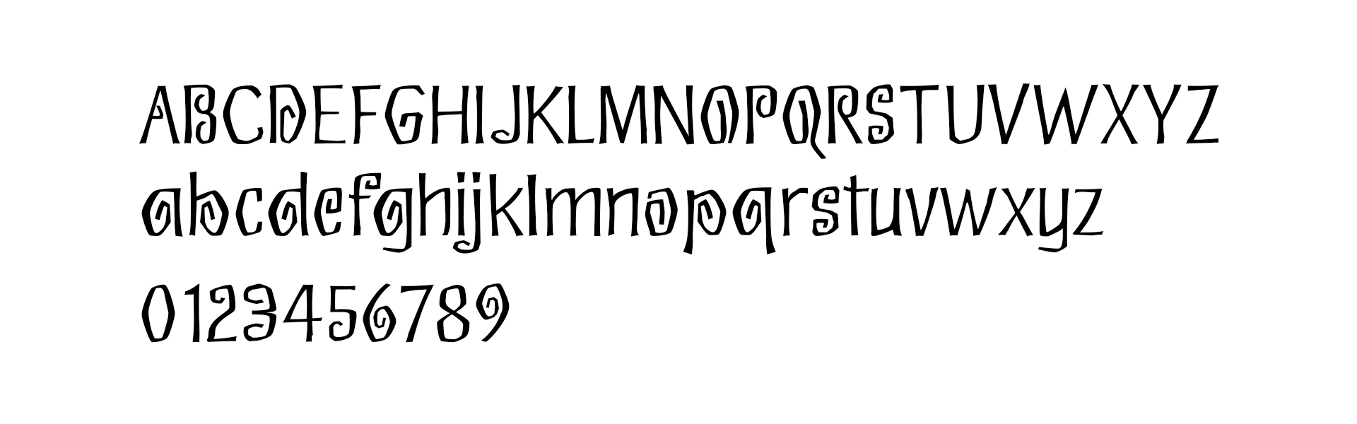
Font: Eskargot
The font used throughout the game is Eskargot. Initially, I wasn’t sure it would work—but after testing multiple options, Eskargot stood out with its unique character. Its angular curves and folded letterforms subtly echoed the game's low-poly style while also adding a magical, otherworldly tone. It later became the primary typeface for both in-game UI and the main logo.
Color Palette:
White became the default for all hand-drawn lines and motifs, helping the UI feel lightweight and readable. The choice of primary accent color was trickier. I was torn between two main shades (shown below), and after testing both individually and in combination, feedback leaned toward using both for contrast. This dual-tone approach gave the UI a subtle richness without overwhelming the visual design.