A project of Big Immersive
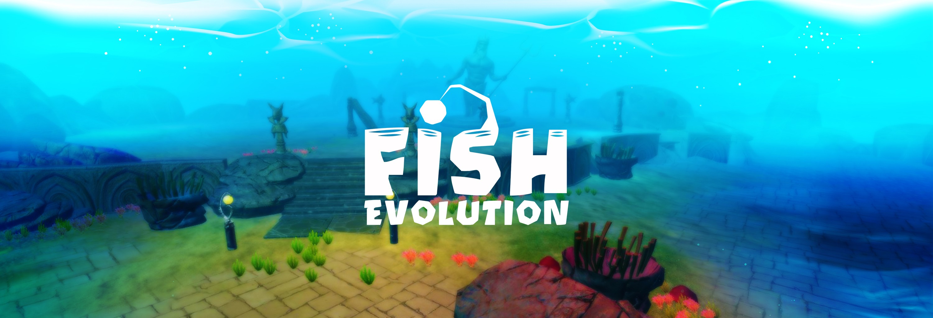
Fish Evolution is an immersive underwater adventure where players start life as a small fish—choosing from species like shark, piranha, swordfish, or puffer fish—and must survive predators, hunt for food, and gradually evolve into the apex predator of the ocean. Though production never continued to move forward, I was the sole designer responsible for creating the game’s complete UI art style.
The project had an experimental twist: we aimed to bring the entire UI into 3D, optimized for a future VR experience. I started with traditional 2D mockups to establish the visual language, and then translated the entire interface into 3D models—textured and styled to maintain consistency with the original 2D look.

Designing UI for VR meant rethinking traditional flat layouts. I first built the UI flow and key visuals in 2D (shown in the section below), then modeled each interface element in 3D. This included UV unwrapping, texture mapping, and styling the forms to feel cohesive with the fun, cartoon-inspired direction we were aiming for. As someone already handling 3D asset design across other studio projects, this hands-on transition from 2D to 3D UI was a welcome challenge—and genuinely fun to execute.
A short video demo is included below to showcase the 3D UI test in action.
– Video presentation for the 3D UI –

Before going full 3D, I created a comprehensive set of 2D mockups for the game’s UI—everything from the HUD to upgrade panels and species selection. These visuals laid the foundation for the 3D translation and were key in establishing the tone and flow of the user experience.

- Loader -
- Game Logo -

– Main menu screen –

– Main fish & side fish selection –

– Options screen –

– Store purchases: DNA –

– Store purchases: EP –

– Store purchases: Bundles –

– Fish upgrades screen –

– Generic popups –

– Heads up display –

Moodboard & Style Exploration:
While Fish Evolution shares conceptual DNA with games like Hungry Shark Evolution, our approach leaned more whimsical and exaggerated—especially in terms of interface. Since this was meant for VR, my visual references focused on bold shapes, oversized icons, and playful elements that would remain readable and engaging within a 3D underwater environment. The result was a cartoon-style UI that felt lively without becoming overwhelming.

– Moodboard –
Typography:
Font : Oetztype
The chosen typeface, Oetztype, struck the right balance between readability and personality. It features rounded, bold letterforms that complemented the bubbly, soft-edged UI shapes from my early wireframes. The font also became a core part of the logo design, reinforcing the lighthearted tone of the game.

– Typography –
Color Palette:
To reflect the underwater setting, the palette revolved around deep sea greens and aquatic blues. These were accented with warm tones like oranges and yellows to highlight interactive elements and player feedback. Since the UI would eventually live in 3D space, I focused on a simplified color identity—avoiding excessive variation in favor of clarity and contrast. Font and shape selections were also carefully tuned to work harmoniously within this palette.
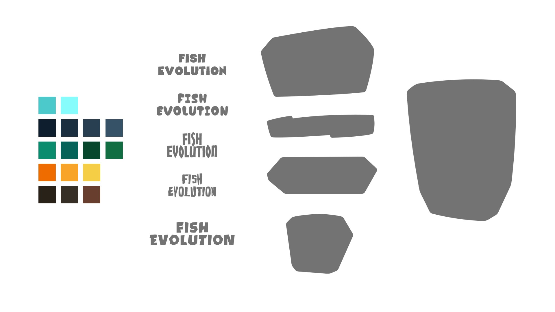
– Color Palette, Font Selection, Shapes –